Examples of Bad Website Design: What Makes a Bad Website?
This article explores common website design mistakes that can harm user experience, brand reputation, and search rankings. Learn how to avoid pitfalls like poor navigation, slow loading speeds, and lack of mobile responsiveness to enhance your site's performance.

A well-designed website is crucial for turning visitors into loyal customers, but common mistakes—like poor navigation, cluttered layouts, or slow load times—can easily drive them away. For small and medium-sized businesses, choosing the right tools to enhance your website is key to avoiding these pitfalls.
HitPay, an all-in-one payment platform, helps over 15,000 businesses worldwide improve their online presence with seamless, integrated payment solutions. In this article, we’ll uncover the most frequent website design errors and share tips on how to create a site that looks great, works smoothly, and keeps your customers coming back.
In this article, we'll dive into the most common website design pitfalls and how to avoid them, covering everything from user experience to visual appeal and site performance.
Key Takeaways
- Effective web design is essential for user engagement and retention.
- Poor navigation and layout contribute to bad website characteristics.
- Understanding website failure reasons can help improve online strategies.
- Usability and aesthetic appeal are key elements of successful websites.
- A focus on functionality can prevent common website design pitfalls.
What Makes a Bad Website?
Knowing what makes a website bad can help you avoid common mistakes in web design. Some poor design traits are easy to spot and hurt the user experience. For example, confusing navigation makes visitors lose interest fast.
In fact, 7% of users won't recommend a business with a poorly designed website, which shows just how crucial a clear and intuitive layout is to keep users engaged and prevent them from feeling overwhelmed by clutter.
Responsive design is also crucial. If a website doesn't work well on different devices, it can lose users. With so many screen sizes out there, being responsive is a must. Weak calls to action can also cause problems; if they're unclear or missing, users might not know what to do next, leading to less engagement.
Here are some common traits to avoid in web design:
- Unclear layout and structure
- Inconsistent navigation menus
- Lack of mobile responsiveness
- Poor colour contrast and readability
- Inadequate calls to action
Knowing what makes a bad website helps spot and fix problems. It also boosts user satisfaction and engagement. Think about how these points might apply to your own site to make it better.
Common Pitfalls in Web Design
Identifying common web design mistakes can significantly improve your site's performance. Various factors can create problems with usability, so it's important to pay attention to these areas to achieve better results.
- Bad Content: Poor content can turn off users. If it doesn't connect with them, they might leave quickly. Good content is clear, concise, and valuable, keeping users interested.
- Slow Loading Speed: Time is precious online. In fact, 53% of mobile users will leave a site if it takes longer than three seconds to load. A slow site can annoy users and lead to high bounce rates. Improving images and coding can make your site load faster.
- Lack of Contact Information: Not providing contact information can make your business seem less trustworthy. Make sure it’s easy for users to reach you by including an email address, phone number, or contact form.
- Poor Organisation and Navigation: A messy site confuses users. Bad navigation makes finding information hard. A clear structure helps visitors find what they need fast.
- Unfriendly User Design: Complex designs can be hard to use. Avoid overwhelming users with too much information. Simple, easy designs keep users happy and engaged.
- Non-Responsive Design: A site that doesn't work well on all devices is a problem. Many people use mobile devices to visit websites. Responsive design is key for keeping users engaged everywhere.
- Missing Calls to Action: Without clear calls to action, users might not do what you want. Adding prompts can greatly improve user interaction and increase conversions.
- Bad Colour Schemes and Fonts: Visuals play a crucial role in a website's success. Poor colour choices or difficult-to-read fonts can drive users away. Selecting appealing design elements is essential to keep visitors engaged.
The Impact of a Bad Website on Your Business

A poorly designed website can create significant challenges for your business, affecting everything from customer retention to overall growth. Understanding how bad web design impacts your business is crucial.
Loss of Potential Customers
When visitors encounter a poor user experience, such as confusing navigation, slow loading times, or broken links, they often leave and turn to a competitor's website instead.
Every time this happens, you miss out on potential sales and valuable leads. Research shows that users form an opinion about a website within 0.05 seconds, so a negative first impression can quickly drive them away.
Negative Brand Perception
Your website is often the first point of contact potential customers have with your business, and a cluttered, outdated, or poorly designed site can quickly create distrust.
Since nearly 4 in 5 consumers need to trust a brand before they even consider making a purchase, an unprofessional appearance or confusing navigation can make your business seem unreliable or out of touch. This negative impression can deter visitors from engaging with your brand, ultimately making them less likely to buy your products or use your services.
Decreased Search Engine Rankings
Search engines, such as Google, prioritise websites that are user-friendly, load quickly, and provide valuable content. A poorly designed site with slow loading times, confusing layouts, or irrelevant content may rank lower in search results, making it harder for potential customers to find you.
Lower rankings lead to reduced visibility, less organic traffic, and fewer opportunities to attract new customers.
Ultimately, a subpar website can damage your customer engagement, weaken your brand reputation, and ultimately hurt your bottom line. Choosing the right website builder is essential to avoid these pitfalls and create a strong online presence.
How to Identify if Your Website is Failing

Identifying early signs that your website is underperforming is crucial for preventing long-term damage to your business. To assess how well your site is doing, you need to combine user feedback with data-driven analysis.
By listening to your visitors and using analytical tools, you can pinpoint areas where your website is not meeting expectations and make the necessary adjustments.
User Feedback and Analytics
User feedback offers essential insights into your website's strengths and weaknesses. Encourage users to share their experiences through surveys, forms, and comments. Addressing issues quickly is crucial, as 90% of consumers prioritise problem resolution in customer service. Feedback helps identify problems such as:
- Difficult navigation
- Slow loading times
- Poor content relevance
- Mobile responsiveness issues
Complement feedback with web analytics to track metrics like bounce rates, session duration, and conversion rates:
- Bounce rates: High rates may indicate design or content issues.
- Session duration: Short times suggest users aren't finding value.
- Conversion rates: Low rates could signal problems with usability or calls to action.
By combining user feedback with analytics, you gain a clear picture of areas needing improvement
Performance Testing Tools
Performance testing tools are essential for detecting and resolving technical issues that may affect your website’s user experience. These tools measure key factors like page load speed, server response time, and compatibility across different browsers and devices.
A site that loads slowly or doesn’t function properly on mobile devices can frustrate users and lead to high abandonment rates. Regular performance testing helps you identify and fix these issues before they escalate, ensuring that your website provides a smooth and consistent experience for all visitors.
SEO Audits and Reports
SEO audits are important for checking how well your site attracts and keeps organic traffic. They look at things like keyword use, backlinks, and site structure. SEO reports give you insights to improve your site's visibility, which can lead to better search engine rankings.
8 Best Practices for Avoiding Web Design Pitfalls
Using effective strategies can make your website perform better and meet user expectations. Following these web design best practices will help improve usability, enhance the user experience, and avoid common pitfalls.
Quality Content Creation
Deliver valuable, relevant content that resonates with your audience. Use clear language and compelling storytelling to keep visitors engaged and coming back. Regular updates ensure your content remains fresh and aligned with user interests.
Optimising Website Speed
If a page takes longer than 3 seconds to load, over a quarter of users will click away and choose a different search result.
Improve load times by:
- Compressing images to reduce file size without sacrificing quality.
- Enabling browser caching to store frequently accessed data for faster retrieval.
- Using clean, efficient coding practices to enhance overall site performance.
Regularly test your site’s speed and make adjustments to ensure it maintains optimal performance. A fast-loading site not only keeps users engaged but also improves your search engine rankings, driving more traffic to your site.
Clear and Accessible Contact Information
Make sure contact details are easy to find on every page, offering multiple ways for users to reach you, such as email, phone, or social media links. This builds trust and ensures users can easily get in touch.
Effective Navigation Structures
Design intuitive, user-friendly navigation with clear labels and categories. Use dropdown menus or site maps to help visitors find information quickly. Consistent navigation across all pages creates a seamless browsing experience.
User-Centric Design Principles
Prioritise user needs by incorporating feedback and running usability tests. Ensure your design is intuitive, with easily understandable elements like buttons and menus. Continuously refine based on user behaviour to improve satisfaction.
Ensuring Responsiveness Across Devices
Implement a responsive design that adapts to all screen sizes, from desktops to smartphones. Test your site on different devices and browsers to ensure consistent performance and appearance, enhancing user experience and broadening your reach.
Strategic Calls to Action
Place clear, compelling CTAs throughout your site to guide users toward key actions, such as signing up or purchasing. Use action-oriented language, contrasting colours, and prominent buttons to maximise effectiveness, especially on high-traffic pages.
Choosing the Right Colours and Fonts
Select visually appealing colours that align with your brand and ensure readability. Use consistent fonts that are easy to read across devices, enhancing the professionalism and user experience of your site.
Get Started With HitPay’s Secure Online Website Builder
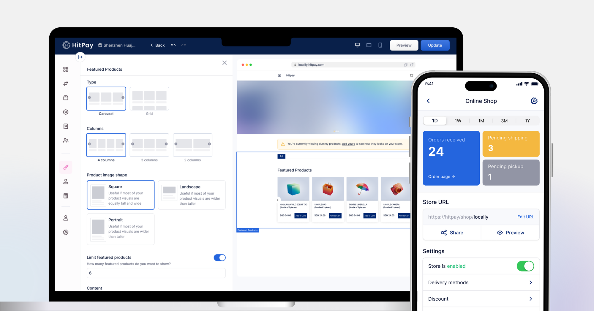
Enhancing your website is essential for staying competitive in a digital landscape. Start by identifying what's not working—issues like slow loading times or confusing navigation can become opportunities for growth and improvement.
By applying the suggestions in this article, you can significantly improve your site's user experience. A more user-friendly website encourages visitors to stay longer, boosts satisfaction, and fosters customer loyalty, all of which contribute to better business outcomes.
Focusing on website improvements sets your business up for long-term success. Keeping your site aligned with your business goals turns it into a powerful tool for reaching customers. Smart design choices and attention to usability will help you build a strong online presence.
Try HitPay’s Online Website Builder for free today. If you're a customer who has questions about paying with HitPay, feel free to contact us on our website.
Frequently Asked Questions about Website Builders
What are the common characteristics of a poorly designed website?
Poorly designed websites often have confusing navigation and cluttered layouts. They also lack responsive design and weak calls to action. These issues cause frustration and make users leave, hurting engagement.
How can a badly designed website impact a business?
A badly designed website can lose potential customers and harm the brand's image. It can also hurt search engine rankings. Visitors might choose competitors with better sites, leading to a loss of customers.
What tools can I use to assess my website's performance?
Use user feedback, analytics tools, performance testing tools, and SEO audits to check your website's performance. These tools spot problems, track engagement, and find technical issues that need fixing.
What are some best practices for improving web design?
Improve web design by creating quality content and ensuring fast loading speeds. Make sure contact info is clear and navigation easy. Use responsive design and focus on user needs.
Why is usability critical for web design?
Usability is key because it lets visitors easily use your website, find what they need, and connect with your brand. A site that's easy to use gets more repeat visits, makes users happier, and boosts conversion rates.
How do design mistakes affect user experience?
Design mistakes like too much clutter, unclear messages, and poor layout can make using your site hard. This leads to user frustration, less engagement, and high bounce rates. It hurts your website's performance overall.

